
Logos
For large organizations or one-person small businesses, I ensure a thoughtful and effective result, an efficient process, and a package of deliverables that will make everyone’s lives easier for years afterward.
Every client, large or small, receives a package of files that are clearly labeled as well as a file type glossary, guide to usage, essentials like official colors and fonts, and a guide to how I name your files. You will always find exactly what you need when you need it.
Evolution vs. Revolution
Organizations often have a logo that generally works, but the original files are no longer usable. I ask questions, examine the file, make improvements, and provide a folder of versatile assets. This service usually takes just a few days from start to delivery.
Others, such as Opportunity Education’s in-house rebranding, reflect a longer process collaborating with C-level stakeholders, conducting in-depth research, and delivering iterative presentations to ensure a successful result aligned with each goal.
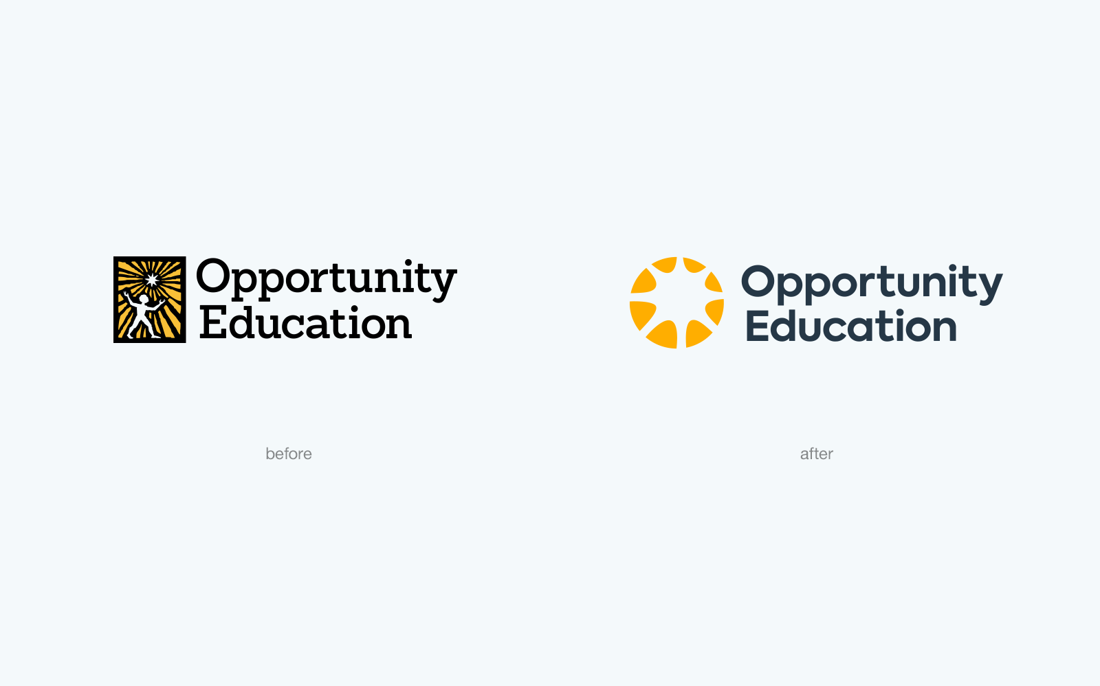
Opportunity Education needed more than a logo, but a brand shift from an international aid organization to an innovative leader in learning for secondary school students, all while honoring its history.
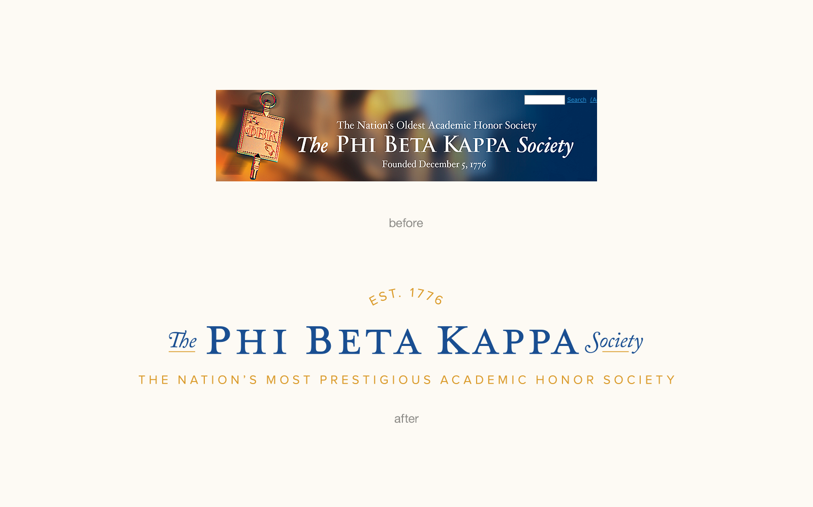
The Phi Beta Kappa Society needed to evolve its branding while paying tribute to its legacy. I introduced Caslon as a successor to fonts no longer in use, which is a typeface with an appropriate history — a version of the typeface was used in the Declaration of Independence, and PBK was founded in 1776.
Check out more of my work with PBK, and my collaboration with fatrabbit Creative, at pbk.org.
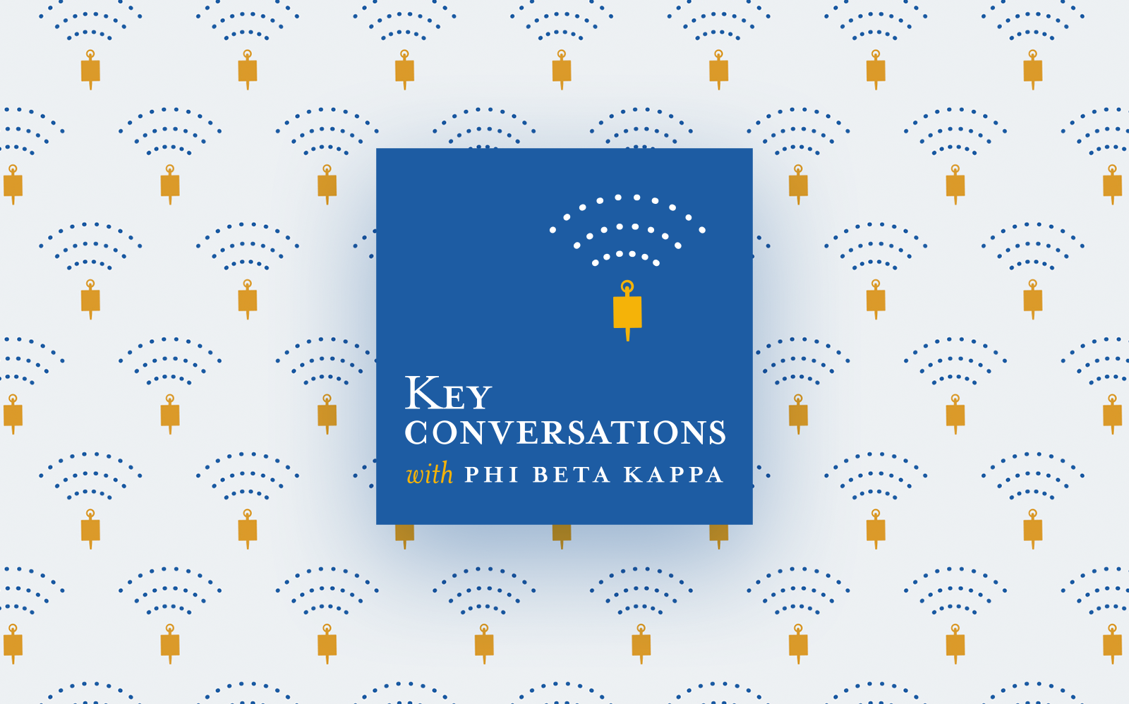
A new podcast from the Phi Beta Kappa Society, called "Key Conversations." The gold key is an iconic symbol of the Society to members, widely worn as a lapel pin or pendant as a symbol of pride.
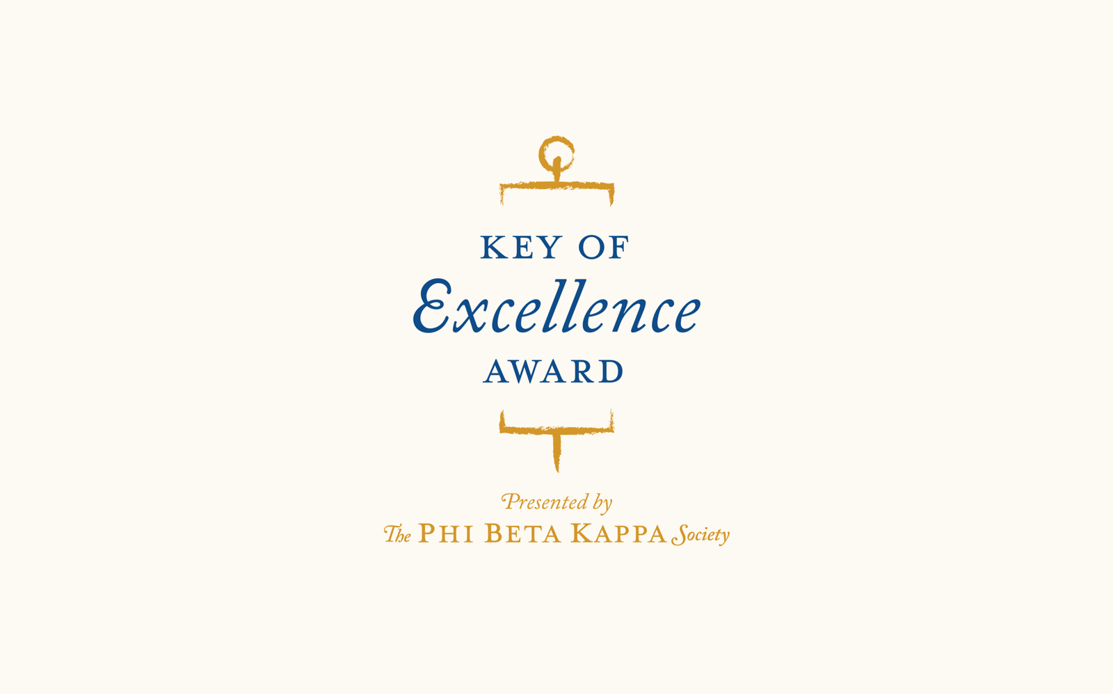
The Phi Beta Kappa Society award showcases innovative programs across the country that reflect the excellence, range, and relevance of the arts and sciences to their communities.
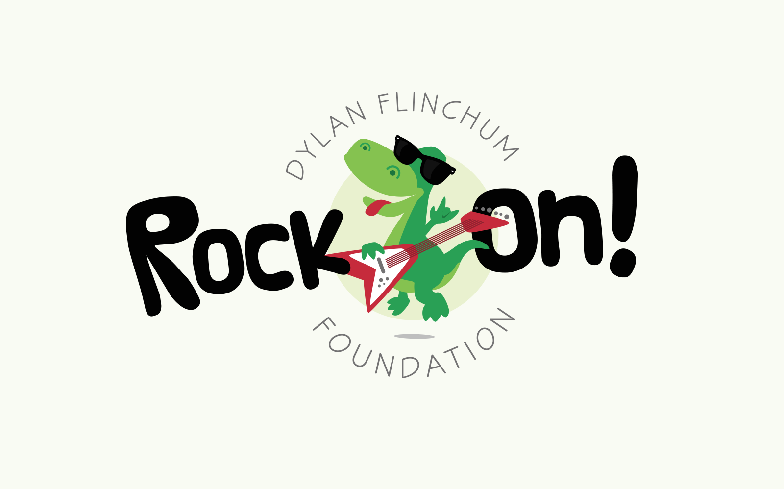
The foundation is dedicated to providing support for a boy with metachromatic leukodystrophy (MLD) and his family, raising awareness of this degenerative disease with no cure, and supporting other families fighting for their children.
Learn how you can help at DylanRockOn.org.
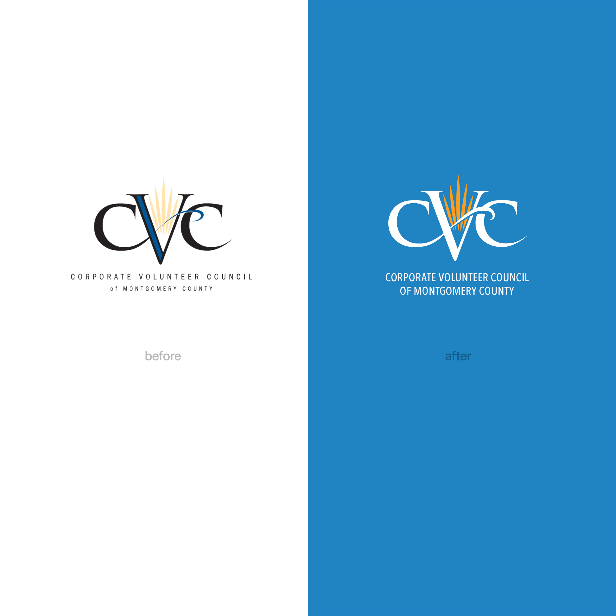
A logo "touch-up" to remove hierarchy in the smaller text and improve reproduction quality.
A quick touchup was needed to refresh a logo that wasn't scaling or reproducing well on sponsorship materials.
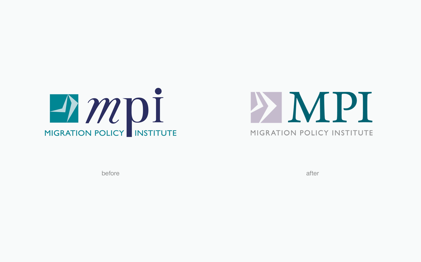
While designing MPI's website, I was able to refresh the logo simultaneously, ensuring characteristics important to the client and the audience remained intact.
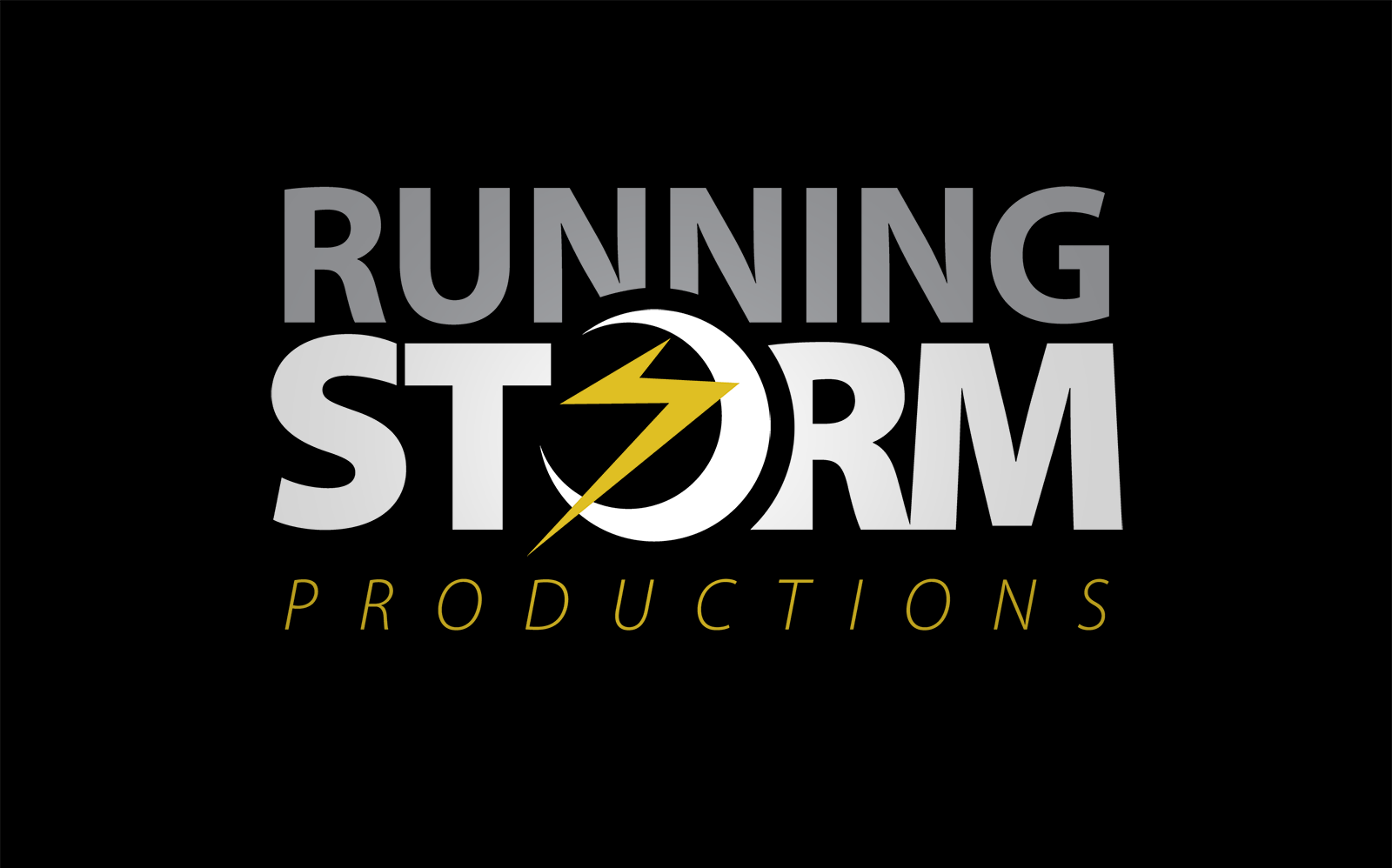
A small but fierce video production company.
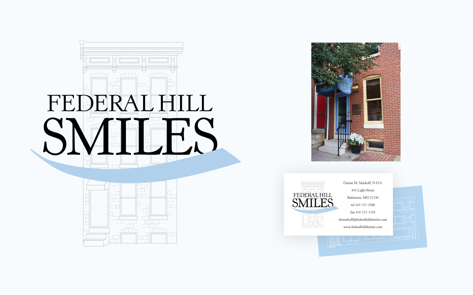
This cosmetic and family dentistry in Baltimore was looking for cleaner, more professional suite of branding materials. An illustration of their classic Federal Hill building had been in their materials since the beginning — so it was a "must" to include — but the old artwork was beyond repair. I re-drew every detail for a scalable, versatile solution they could use anywhere.
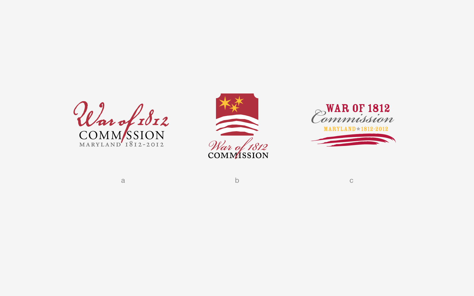
Proposals for Maryland's War of 1812 Commission.

Proposed re-design for the cutting-edge technology and gaming brand.
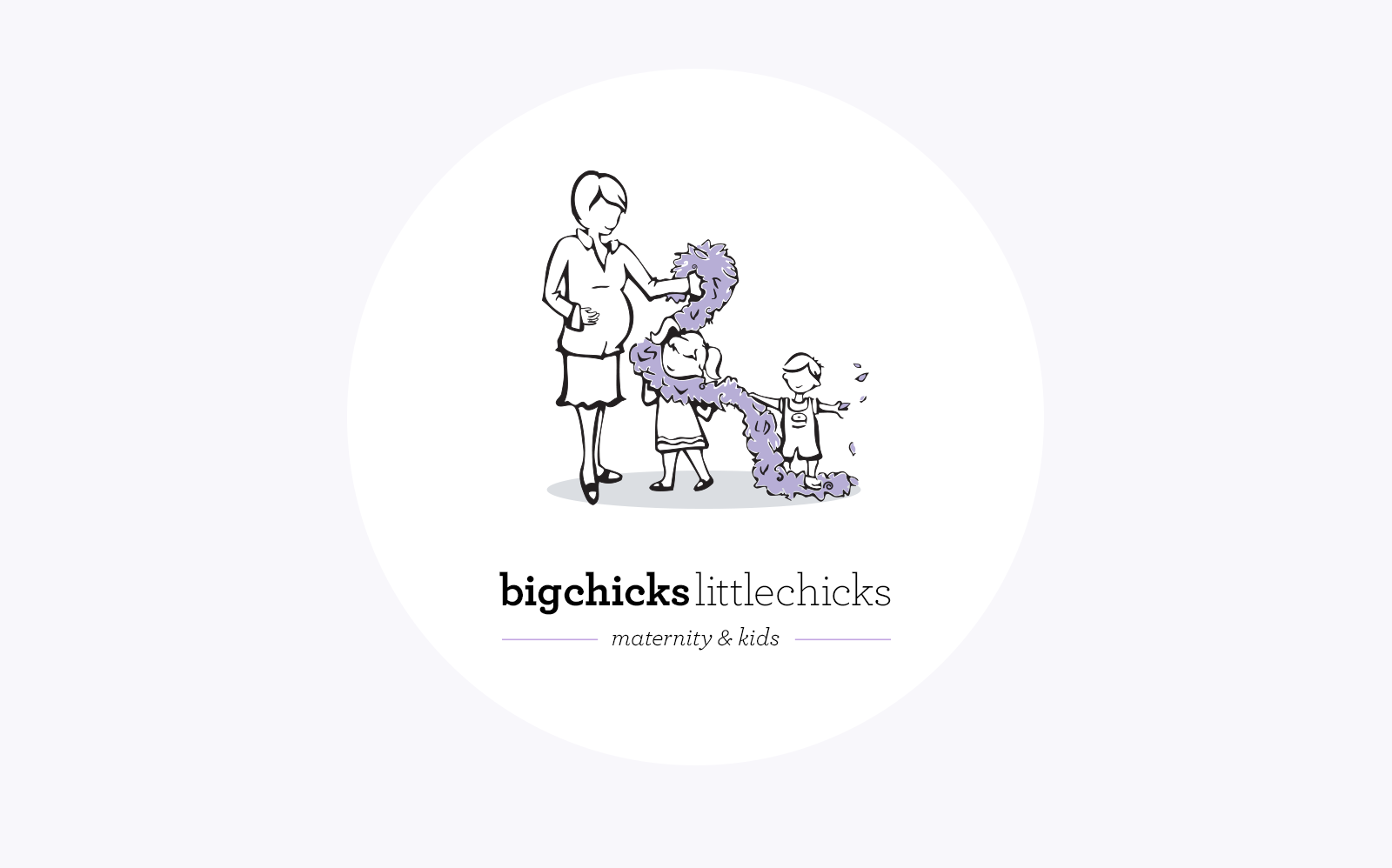
A shop specializing in clothing and accessories for pregnant women and their children in one place.
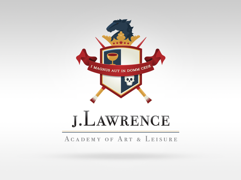
A mock coat of arms assignment for a wine-and-art series of events.